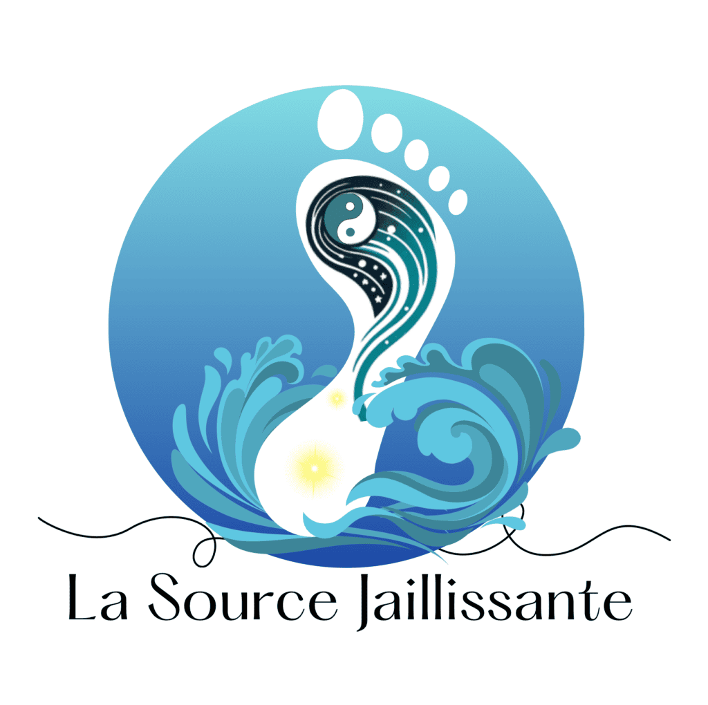
Un projet d’identité visuelle complet pour La Source Jaillissante, une école de Qi Gong. Inspirée du point méridien symbole d’une énergie fraîche et en mouvement, cette identité visuelle reflète les racines ancestrales de cette pratique chinoise tout en incarnant son objectif fondamental : améliorer et préserver la santé et le bien-être.
The Challenge
Après une première expérience décevante auprès d’une agence de design, Stéphane me fit confiance en me confiant le branding de son activité. L’objectif était de concevoir une identité fidèle aux racines ancestrales du Qi Gong, tout en capturant l’énergie et l’humanité d’un enseignant passionné. Comme le Qi Gong est une discipline encore peu connue, il était important de créer une identité qui sorte des codes classiques du bien-être, souvent dominés par le yoga ou le tai-chi, afin d’intriguer et de capter l’intérêt dès le premier regard.
The Process
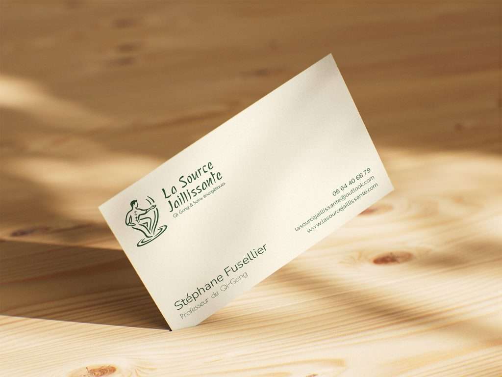
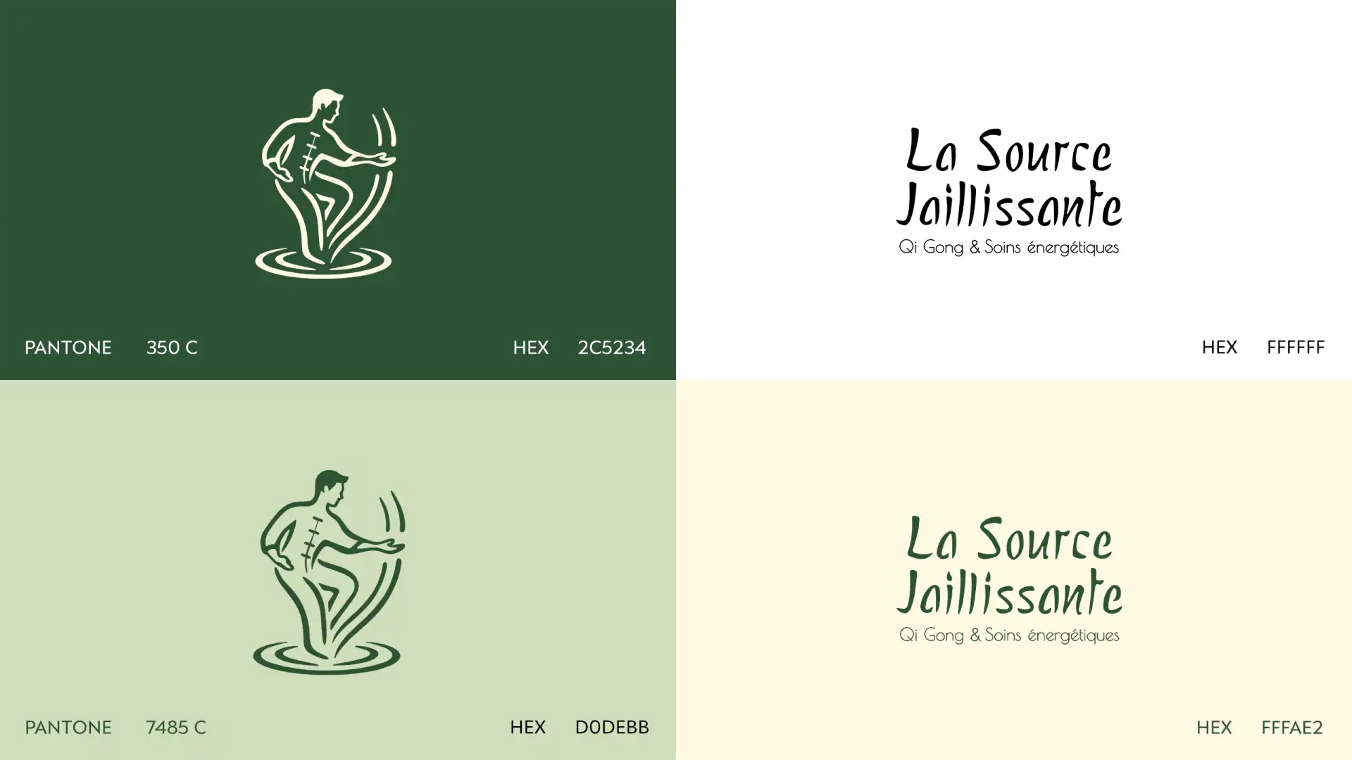
L’icône s’inspire du Yong Quan, point d’acupuncture appelé « Source jaillissante », lieu où le Qi (énergie vitale) prend naissance et commence à circuler vers le haut du corps, à l’image de l’eau jaillissant d’une source. Elle représente une personne en pleine pratique, incarnant ce mouvement énergétique. Après une phase d’idéation menée à l’aide de l’intelligence artificielle, la figure retenue a été retravaillée manuellement : vectorisation, simplification des formes et affinage du trait, afin d’obtenir un dessin fluide, dynamique et épuré.
Le wordmark traduit un équilibre entre douceur organique et clarté structurelle, en écho à l’harmonie au cœur du Qi Gong. Le style typographique s’inspire du geste du pinceau tout en conservant une esthétique moderne et lisible. L’ensemble forme une identité visuelle qui respecte les racines ancestrales de la discipline tout en restant contemporaine et accessible.
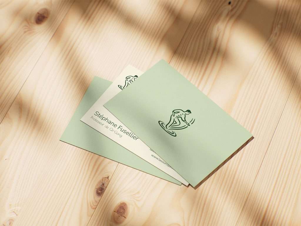
La palette de couleurs renforce cette notion d’énergie et de renouveau : un vert forêt profond, ancré dans la nature, est associé à un vert sauge plus clair évoquant sérénité et équilibre. Le beige clair et le blanc apportent respiration et contraste, laissant l’énergie circuler librement.
BEFORE
AFTER
The Result
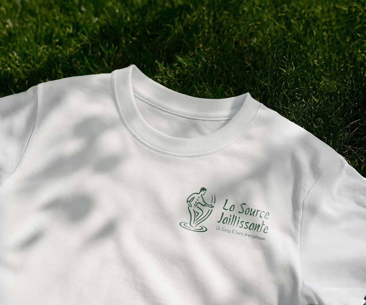
Le logo final incarne à la fois le mouvement du Qi Gong et le flux énergétique qu’il génère, créant un lien harmonieux entre le corps, la pratique et la vitalité intérieure. L’identité visuelle reflète la philosophie de la marque : une énergie en circulation constante, ancrée dans la nature et ouverte sur le monde. L’ensemble — logo, typographie et palette — évoque équilibre et douceur, en cohérence avec l’expérience du Qi Gong.
Le client s’est pleinement reconnu dans cette approche. De mon côté, ce projet m’a permis d’affiner l’équilibre entre intuition et méthode, d’intégrer l’intelligence artificielle au processus d’idéation et de traduire une énergie immatérielle en langage visuel.
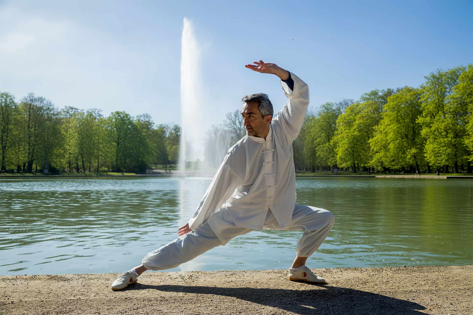
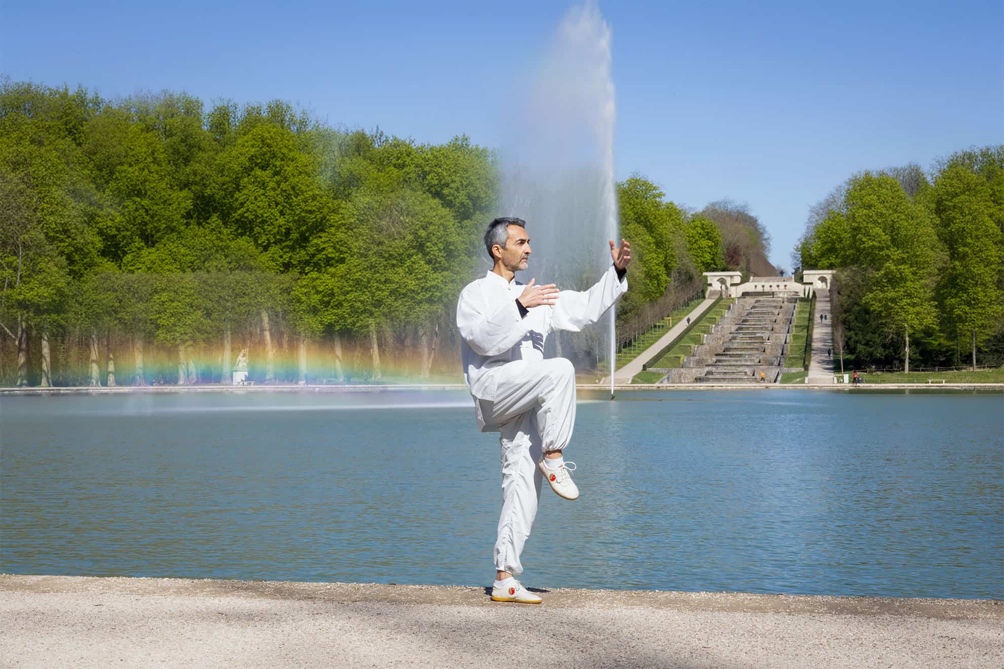
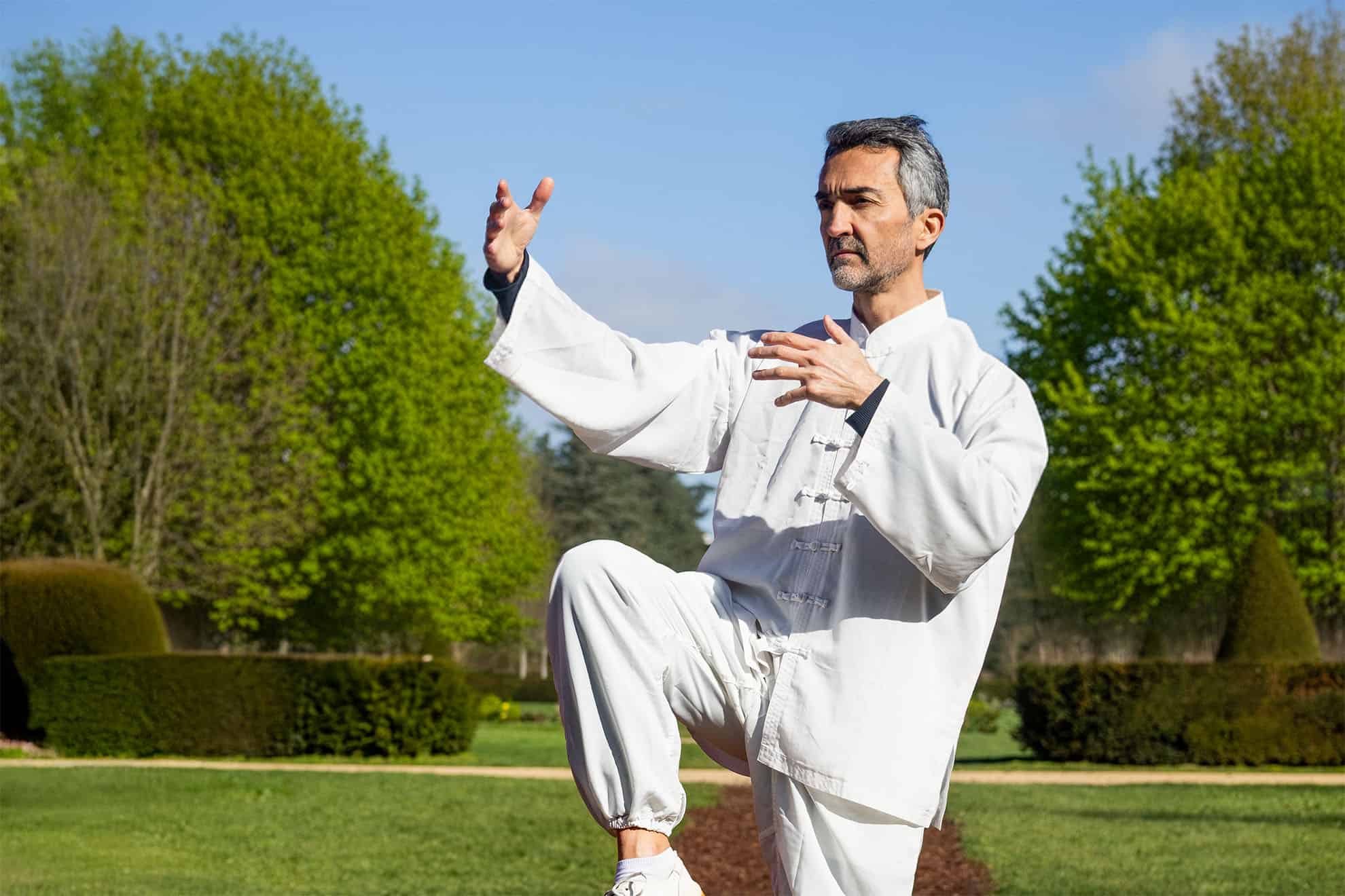
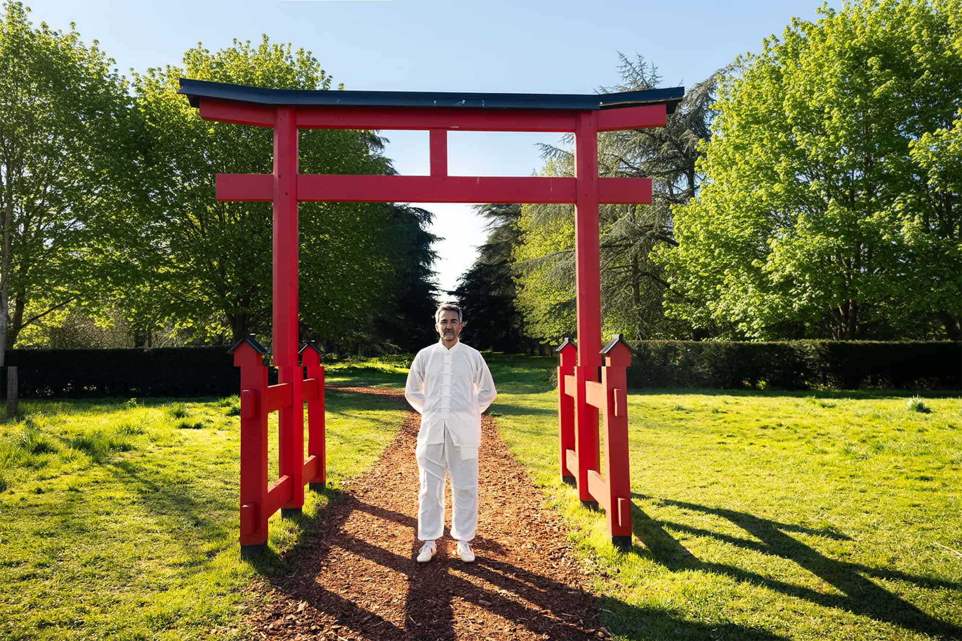
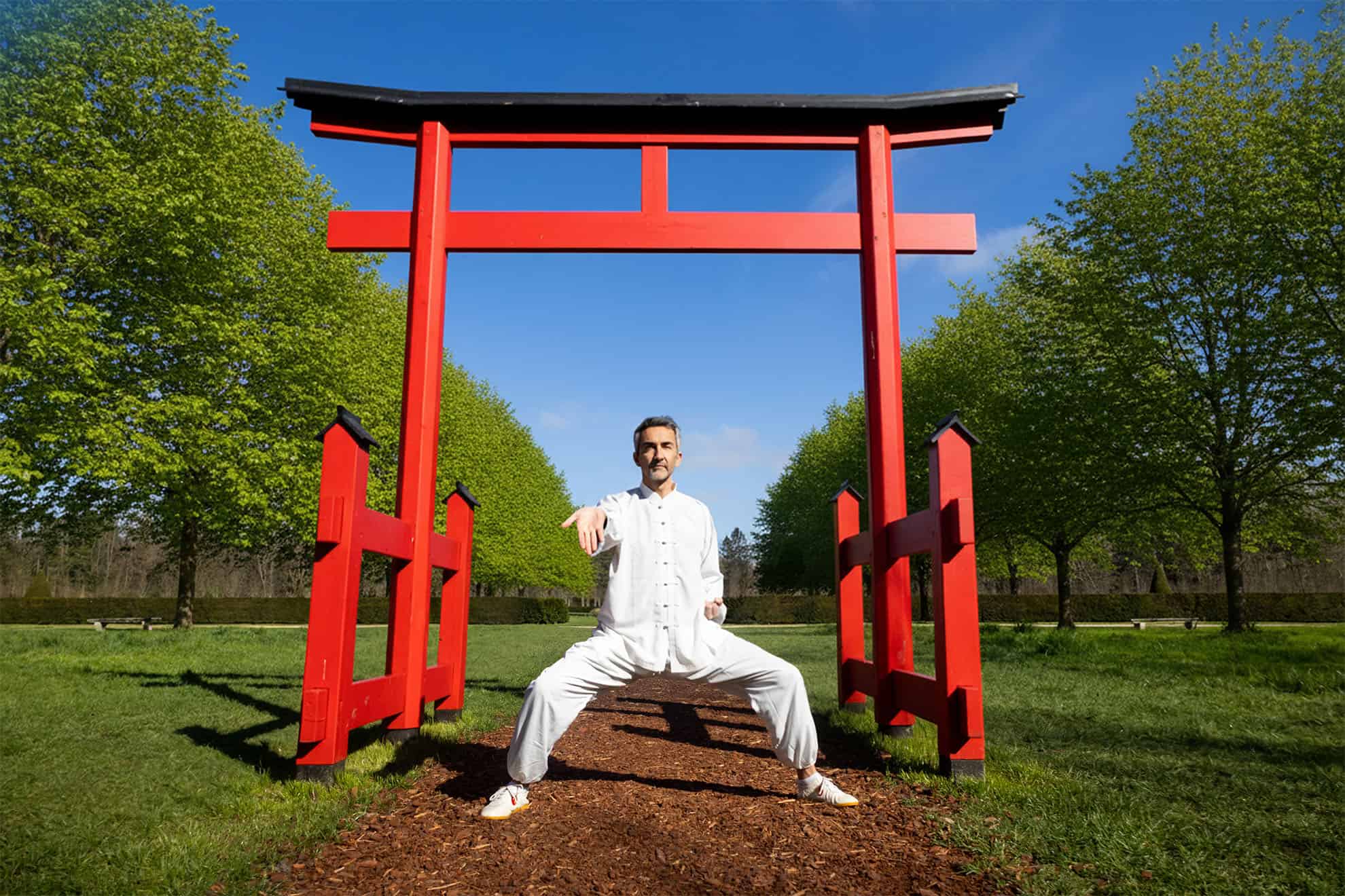
Photography
Canon R6 mark II
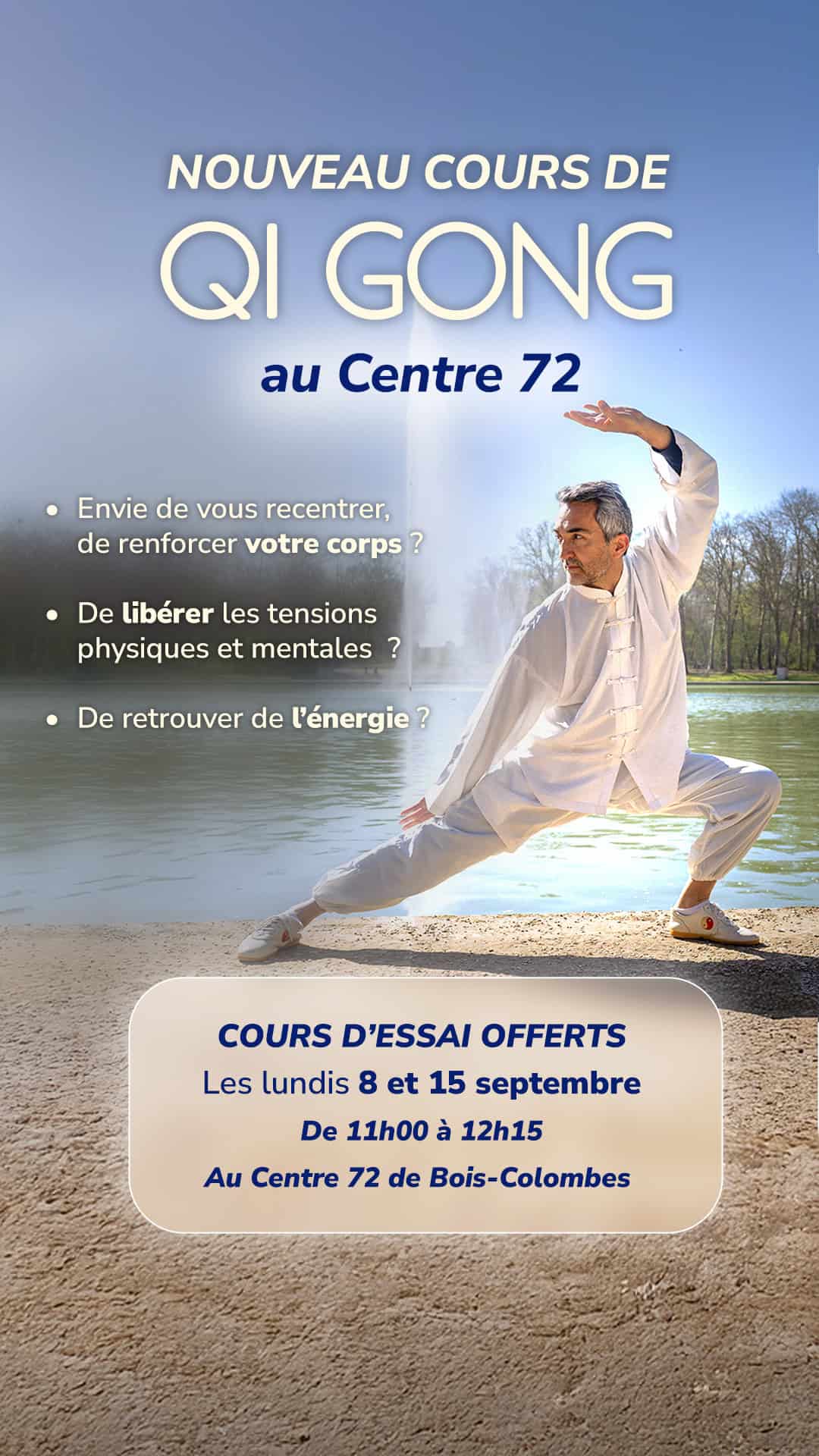
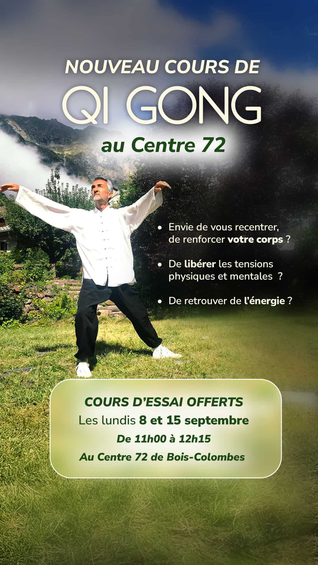
Meta Ads
Pour promouvoir l’ouverture de nouveaux cours, j’ai imaginé et produit deux packs de créations Meta Ads, pilotés depuis le Meta Ads Center. La campagne reposait sur une approche orientée performance : clarté du message, lisibilité mobile et mise en avant des bénéfices.
Diffusée sur une période d’un mois, la campagne Meta Ads a permis d’atteindre un taux de conversion de 20 %, avec un ROAS de 2,7, générant 10 nouveaux clients pour l’activité.
Témoignage Client
« Stella m’a accompagné de la refonte de mon identité visuelle à la mise en place de campagnes Meta Ads pour le lancement de mes cours de Qi Gong. Son approche stratégique et créative a généré des résultats concrets, me permettant d’ouvrir deux nouveaux cours. Je réutilise aujourd’hui cette campagne régulièrement et recommande vivement son travail. »