A comprehensive brand strategy and visual identity project for Rumble, a digital advertising agency.
This rebranding aimed to strengthen Rumble’s differentiation, assert its premium creative positioning, and embody its belief that the combination of creativity and data is the most powerful driver of performance.
The Challenge
The objective of Rumble’s rebranding was to assert its distinctiveness and reinforce its premium creative positioning. At the core of the project was a strong belief: performance emerges from the convergence of creativity and data.
The founding insight was straightforward : while many agencies promise growth, few clearly explain how they deliver it. Rumble chose to communicate its approach with clarity and transparency, always starting from the audience. The brand positioning was therefore built around the central role of the audience, considered the starting point of any effective, relevant, and sustainable strategy.
The Process
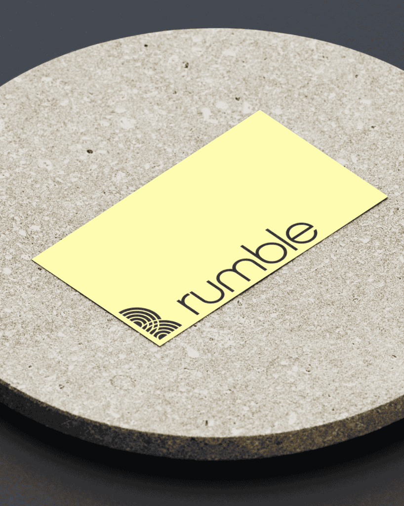
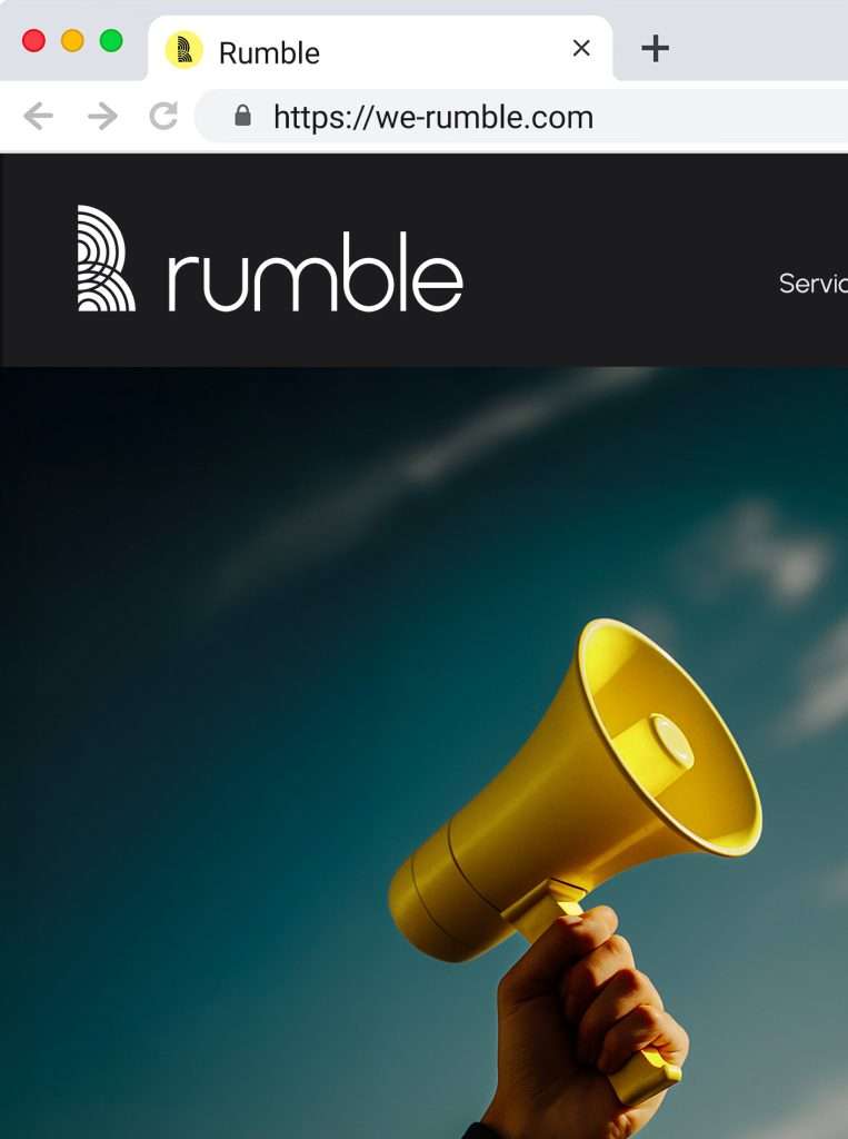
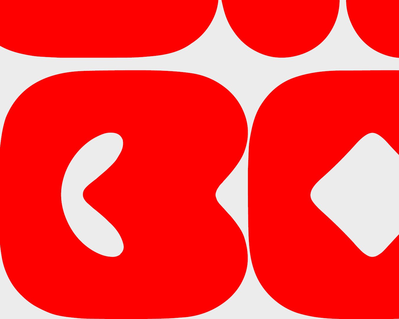
Rumble’s logo draws inspiration from the meaning of the brand’s name: a deep, resonant sound. Interlocking circles form a visual echo, illustrating the diffusion of a signal from a central source.
Through duplication and cropping of these shapes, the letter “R” gradually emerges, creating a direct connection between the symbol and the agency’s name. A second reading is also possible: when mirrored, this “R” suggests a radiant human silhouette, an allegory of Rumble’s mission to amplify brands through the audiences they engage.
The color palette is built around a soft, luminous yellow, symbolizing creativity and energy, paired with an off-white that conveys clarity and openness, and a deep black that structures the system and expresses reliability. This balance supports both Rumble’s creative boldness and its ambition to position itself as a premium, audience-centric strategic partner.
The Result
Through this new identity, the agency asserts its ambition to elevate advertising into content that is chosen and appreciated rather than endured, by combining creative excellence with data rigor.
This renewed strategy enables Rumble to communicate its services with clarity and impact, supported by a strong artistic direction and a narrative fully aligned with its strategic ambitions.
Témoignage Client
“Stella has a strong artistic sensibility and a solid understanding of brand challenges. The rebranding of our visual identity is accomplished and fully aligned with what we were looking for.”