La Source
Jaillissante

2025

Visual Identity
Motion
Content Creation
Meta Ads

A complete visual identity project for La Source Jaillissante, a Qi Gong school. Inspired by the meridian point symbolizing fresh, flowing energy, this visual identity reflects the ancestral roots of this Chinese practice while embodying its core purpose: to improve and preserve health and well-being.

The Challenge

After a disappointing first experience with a design agency, Stéphane placed his trust in me to lead the branding of his practice.
The objective was to create an identity that remained true to the ancestral roots of Qi Gong while capturing the energy and humanity of a passionate teacher. As Qi Gong is still a relatively unfamiliar discipline, it was important to move beyond the conventional visual codes of the wellness industry, often dominated by yoga or tai chi, in order to intrigue and capture attention at first glance.

The Process

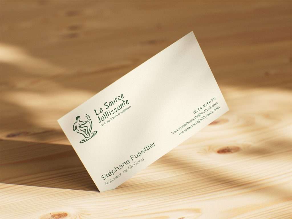
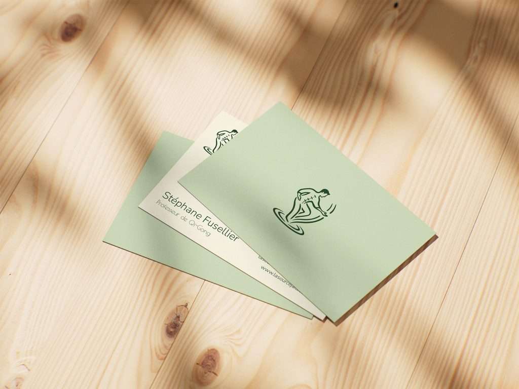
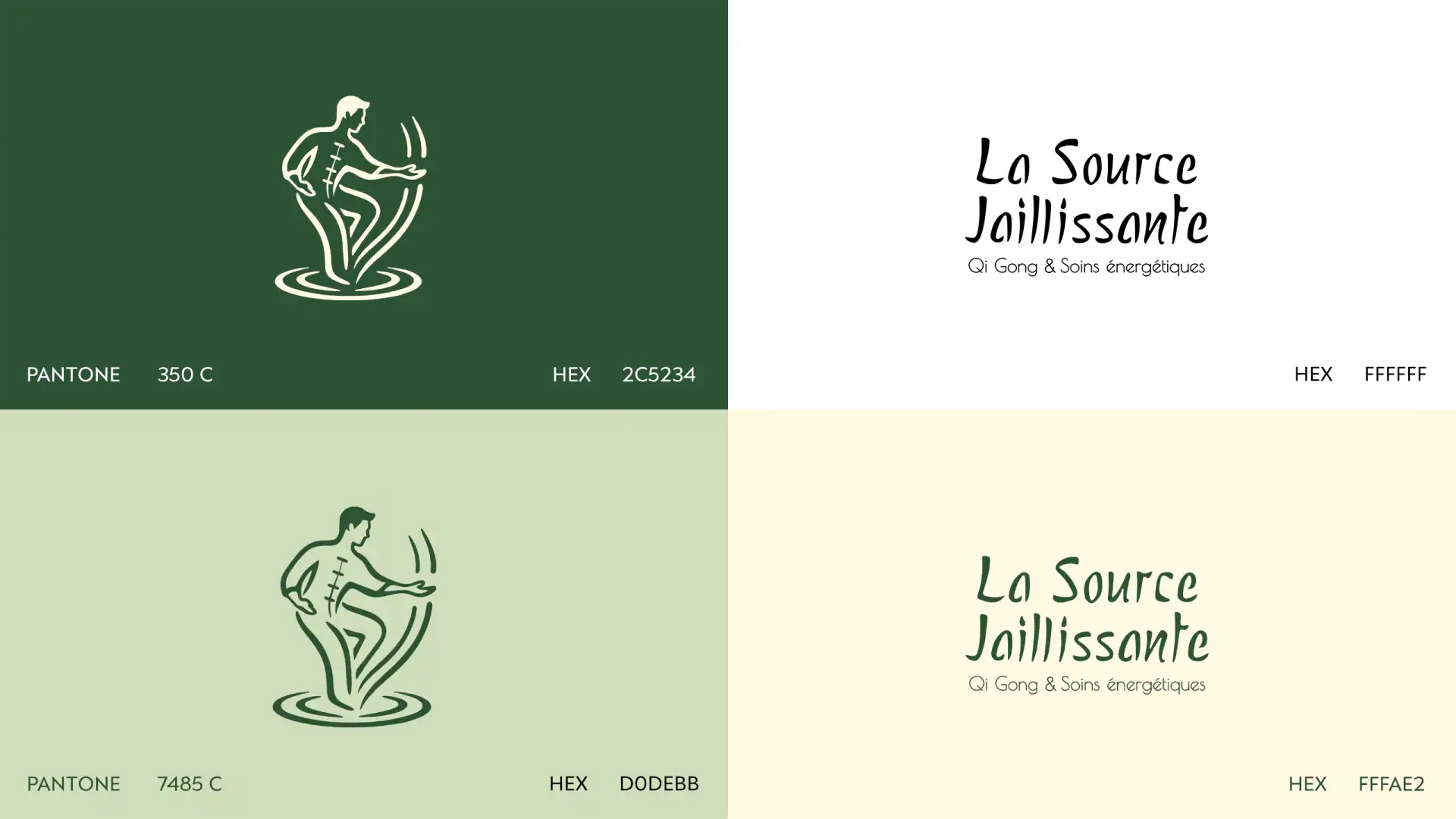
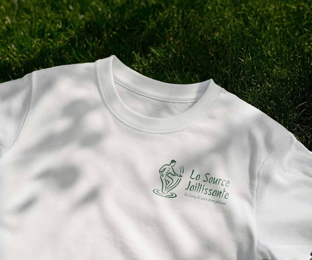
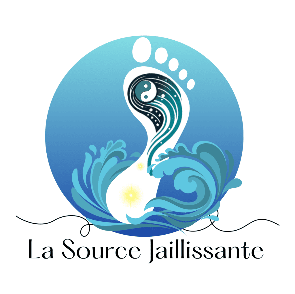
The icon is inspired by Yong Quan, the acupuncture point known as the “Gushing Spring,” where Qi (vital energy) originates and begins to flow upward through the body, much like water emerging from a spring. It depicts a person in the midst of practice, embodying this energetic movement. After an initial ideation phase supported by artificial intelligence, the selected figure was refined manually through vectorization, shape simplification, and line refinement to achieve a fluid, dynamic, and minimal form. The wordmark expresses a balance between organic softness and structural clarity, echoing the harmony at the heart of Qi Gong. Its typographic style draws inspiration from brush gestures while maintaining a modern, legible aesthetic. Together, the icon and wordmark form a visual identity that honors the discipline’s ancestral roots while remaining contemporary and accessible. The color palette reinforces this sense of energy and renewal: a deep forest green, grounded in nature, is paired with a lighter sage green evoking serenity and balance. Soft beige and white introduce breathing space and contrast, allowing the energy to flow freely across the identity.

BEFORE

AFTER

full logo -SJ

The Result

The final logo embodies both the movement of Qi Gong and the energetic flow it generates, creating a harmonious connection between the body, the practice, and inner vitality. The visual identity reflects the brand’s philosophy: energy in constant circulation, rooted in nature and open to the world. The overall system evokes balance and softness, in harmony with the Qi Gong experience.

The client fully connected with this approach. On my side, the project allowed me to refine the balance between intuition and method, integrate artificial intelligence into the ideation process, and translate an immaterial energy into a visual language.

Photography

Canon R6 mark II

Meta Ads

To promote the launch of new classes, I designed and produced two Meta Ads creative packs, managed through the Meta Ads Manager. The campaign was built around a performance-driven approach, focusing on message clarity, mobile readability, and a strong emphasis on key benefits.

Running over a one-month period, the Meta Ads campaign achieved a 20% conversion rate with a ROAS of 2.7, generating 10 new clients for the business.

Témoignage Client

“Stella supported me from the redesign of my visual identity through to the launch of Meta Ads campaigns for my Qi Gong classes. Her strategic and creative approach delivered tangible results, enabling me to open two new classes. I continue to reuse this campaign regularly and highly recommend her work.”

Stéphane — Qi Gong Professor

LA SOURCE JAILLISSANTE

Branding

2025

OTHER PROJECTS

Booish

Typography - Design

Rumble

Branding - Visual Identity

Andarz

Branding - Visual Identity

Soltros

Logo Design - Motion

© 2026 by Stella Bahia